
 I've been offline for some time as I'm trying to put this business pursuit online! (LOOK here above!)
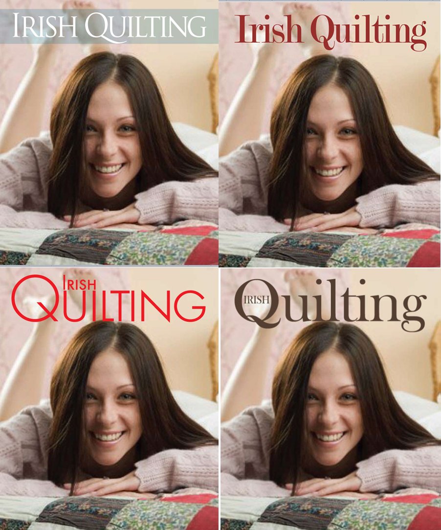
Things are really moving now. Designs are in and, people, take a vote! Please leave a comment and let us know which title (font text) jumps out at you and says "Buy Me".
For ease sake, let's number them 1-2-3-4 starting at top left and going clockwise, or state color font just in case. And if makes you want to comment any more, I'll draw a random name and send him or her a bonafide Irish Beans Chocolate Bar...yummy!
The inset picture is just filler. (Though we do intend to bring the quilting stereotype down in age!) The plan is not to use people/faces in the cover features, but to use Irish landmarks as the magazine is really meant to scream, "Buy Me, I'm Irish!"
**These are examples we found: photographs (taken by Cheryl Johnson) and appear in Pat Sloan's book, Tour of Ireland published by Leisure Arts.
 'Top of the morning to y'all.


13 comments:
I like the one in the upper left. Love the photos - both rural and urban.
I like 3 or 4 in no particular order. This is going to be GREAT!
Looks good. I like #3 because "Irish" within the 'Q' is is charming although quite small so if the point is to emphasize Irish then #1 is my next choice. I think the gray band helps to make the title stand out.
Looking forward to seeing the finished product.
oooh, so exciting Sherry! I like #3, but prefer the red of #4. I'd maybe try using #3 and putting the text "Irish" in red inside the Q to make it pop. (or vice-versa on the colors, whichever works best). Then that gives you a nice 2 color pallet to work with. I also like the font as it's softer and more organic, like quilting itself is. The only other comment is to move down the photos of the girl so the text isn't running into her hair.
Great work! I'm so excited for you and to watch the business grow. Exciting times ahead!
I like the first one best. When I was thinking about it for you I was thinking of using a celtic font for the Q that wouldn't be as clean as these typefaces.
That book that you got the quilt photos from, Pat Sloan's quilts, lol, was just done last year. I met her in Killarney, and I think I might possibly be in the group photo on that book, eek!! So they are fairly new and cute, but here looking forward to seeing your magazine! You go girl!!
I dislike the bottom left one, seems unbalanced somehow - the Q is too big, perhaps. Not sure which I like best - maybe the top left, it's quite modern looking.
Bottom Left...much more modern looking...and if you're aiming at the younger market............
Number 1 is my favorite. I'm excited as you!!
Number 1 is my choice!! The band across the title draws your eye to it and it is simple, let the photos stand out!!! Very exciting!!!!!
WOW! SO GREAT! I vote for #1 and the one with Irish inside the Q! It's so nice! Good job!
I like #3 the best, maybe I am weird? but I like that color...
Okay, one more comment to add to the list. I think I like No. 2 or 4. I guess it depends on what the emphasis is on. Is it solely Irish quilting or is it quilting with an Irish twist? The answer to that would determine (for me) how large the word Irish should be. Also I like No. 2 but perhaps that's because the colour of the font matches this particular picture. It might be limiting with other pics. So perhaps in the long run No. 4 is the best option. There ya go for a muddled comment....!
Based on your goal/objective and the photos you'll be using, I'd say #1. :)
Post a Comment